Cloud
#F3F6FEPrimary canvas and generous negative space

A way of working becomes a system.
A system becomes a network.
The origin stays unmistakably yours.Your way of working.
A system worth repeating.
Franchising is the transfer of a way of doing things. Knowledge travels. Standards repeat. A new location carries the character of the original.
Our visual language starts there: one point, expanding rings, a recognizable rhythm. Inspired by a drop on water and the reverberation of sound, it makes expansion feel connected to its source.
The business you built.
A repeatable system.
Room for another chapter.
A metaphor for possibility. It does not promise growth, revenue or legal approval.
Just franx. Original fluid lettering: rounded arches, a single-storey a and a continuous a/n connection, inspired by the owner’s fluid reference. Color travels through the letters; hover or focus reveals their outline. The old ring icon is retired: reverberation lives in the imagery.
Keep it open. Use the fluid lettering on quiet surfaces. Minimum width: 72px. Use solid Ink for small or utilitarian applications.
Let the name stand alone. No ring icon, badge or added dot. Use franx.ai in prose and URLs, franx in the wordmark.
Keep the color in motion. Gentle pointer color changes and an outline reveal on hover or focus. Reduced-motion and the home pause control are respected.
Cloud-white space, a blue anchor, cool water and iris reflections, with a little coral warmth. Close to the supplied image, practical across real applications.
#F3F6FEPrimary canvas and generous negative space
#172B4DHeadlines, body copy and solid wordmark
#315FCEPrimary actions, links and wordmark outlines
#6B9DEBThe main chromatic wave
#A7E8EFLight, edges and cool reflections
#B6A0ECDepth and soft transitions
#F4A3AEWarmth around the point of origin
#F2C9F3Small luminous accents
Use Ink for copy and Action blue for controls. Pastels belong to backgrounds and illustration. Source badges retain their separate functional green.
One visual language, different distances. Alternate open arctic fields, close details, the original pearlescent image and contextual scenes. Keep white space between them.
Master reference / Image supplied by the project owner


01Crop the rings.
Never stretch them.
02Keep one origin
per composition.
03Leave a quiet field
for the message.
04Use white surfaces
for working content.
A slow outward pulse. A slight response to the pointer. Dark headline accents catch the passing wave. Reading stays steady.
Preview is still until you choose to animate it.
Recognize the work the owner has already done. Start with their business, not with a claim about AI.
Talk about drafts, manuals, sources and process maps. Invite people to inspect the work.
Do not invent results or imply legal approval. Distinguish software from independent professional review.
“One business. A wider echo.”
“Source-linked drafts. Clear next steps.”
“Start free.”
A recognizable family across the website, document covers, presentations and social content. Keep working pages simple and white.
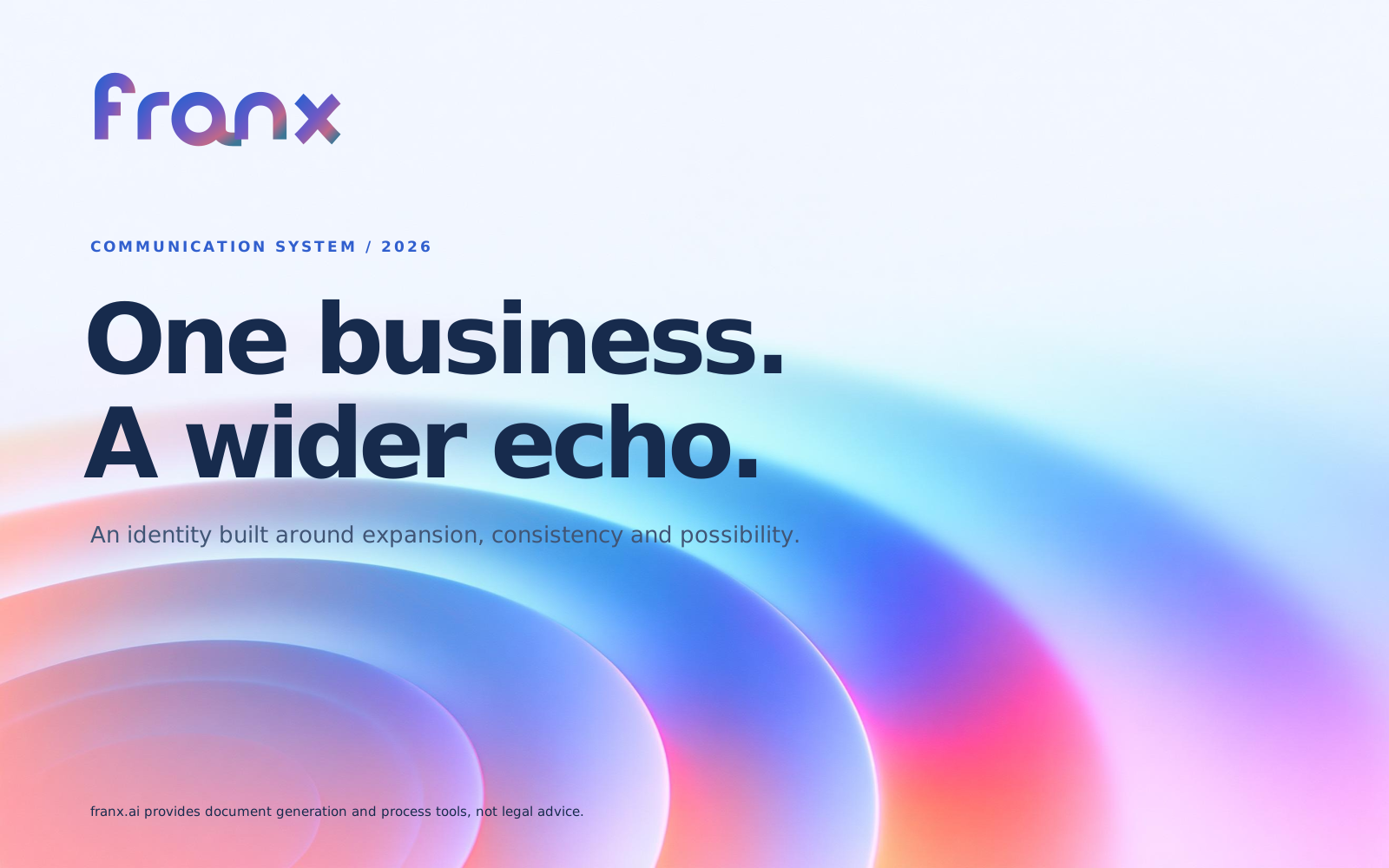
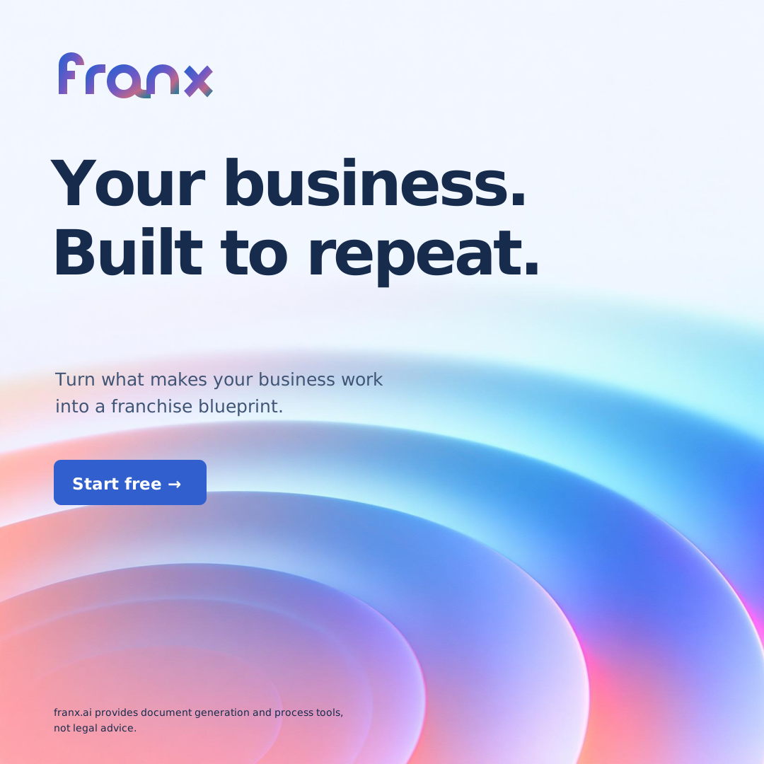
The written manual, wordmarks, new arctic variations, palette and editable starting points. The wordmark SVGs are original vector paths and need no font. Template body text uses DM Sans.
Version 2.0 · November 18, 2026 · Public communication in U.S. English. The supplied reference image is unchanged; the vector pattern is an interpretation. Templates show communication layouts, not customer results.